Menu
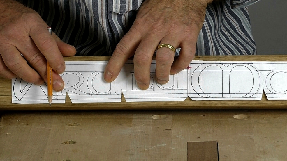
'Celtic' lettering is more properly called 'uncial' or 'half uncial'. It was the sort of alphabet used by scribes in the Dark Ages when writing their illuminated bibles (such as the Book of Kells). Here I'm carving some Gaelic into the edge of a fire mantel. There is nothing really different in carving this form of letter to most others but we can usefully see the work here as a paradigm for the step-by-step lettering process as a whole.
In this first workshop I'll look at the 2 most important aspects of layout. At the end, I'll make one of the most important comment for woodcarvers about letter carving.
You'll find the alphabet, which I designed specially to carve, along with some notes in the download below.
I'd also strongly recommend looking at the written version of Celtic lettering that you'll find in my book, 'Lettercarving in Wood - A Practical Course' which I believe is still in print. If you can't find it, or it seems out of print, do let the publishers know...

| 05 November 2022 13:11
Bob - There isn't a 'capital version' in the way that there are capitals (upper case) and small (lower case) letters in the Roman alphabet. Just use the same form of a letter but make it larger.
How large? No rule here; use your judgement as to what looks right. But, as guide: myself, I tend to make the ratios of capital:small letter about 4:3.

| 04 November 2022 17:38
Chris, are capital versions available? I need a capital B in particular…
Thx, Bob
| 22 July 2020 20:18
Lucy - In reverse order... P is definitely there in the download; O is Q without the tail, and N... mmm, fair cop, I should have put it in, or said: it's the 'U' upside down. Sorry it was confusing.
I hope you can see how the elements of the various letters are sort of swapped around to make up a family with related in their characteristics (for example N like H).
| 07 January 2018 19:41
Mike - As far as I know, all my books have been let go out of print and the publishers are looking to reprint using a digital-based system, rather than the film-based one that has been always been used. It's the way publishing is going now.
If I'd known how much copies were going for, I'd have kept some for myself! The prices I have heard of are ridiculous.
| 07 January 2018 08:40
Chris your "lettercarving in wood" is still available but only at ridiculously high prices because it is in short supply. Is their any chance we can get the publishers to reprint?

| 18 March 2017 15:54
The book is out of print. Some web sites have it for $3,000. See my other comments in the Rob Cosman section...
| 22 February 2016 17:26
William - If you look at the Celtic font in my book, 'Lettercarving in Wood', you'll see it overlaid on a grid. You'll also see how letters are built up of the same curve; for example a, b, c, d all use the same curve, added to with an upright or reversed etc. The ur-curve, so to speak, I drew by eye. I seem to remember a compass in there somewhere but not a French curve in sight... I've had my design of Celtic alphabet a while now and I don't redraw it each time I need it; I print it out and play with it, which you are welcome to do as well!
| 22 February 2016 17:16
Siegmar - Bitte schön. Das ist, was das Bulletin ist es für. Lassen Sie uns halten diese in Englisch! Let's keep this in English! Scanners that can increase or decrease the font size very quickly are indeed very useful. But you are right: your naked eye should be the final arbiter of harmony.

| 21 February 2016 16:29
Die Schrift kann man entweder herunterladen oder aus dem LETTERCARVING IN WOOD kopieren und die Schriftgröße mit einem Bildbearbeitungsprogramm oder Scanner variieren. Die Aneinanderreihung der einzelnen Buchstaben erfolgt mit freiem Auge, um so ein harmonisches Schriftbild zu erzielen!
| 21 February 2016 01:22
Danke, dass Sie mich per Mail auf diese Lektion aufmerksam gemacht haben.
| 20 February 2016 16:50
That's a neat trick with the adhesive and spirit. I've laboured over more strenuous methods over the years!
Thanks.