Menu
I love incising the curves; it feels like dancing, and definitely more like carving than does chopping in the uprights or serifs. As before, there is a pattern, an approach to cutting them, and once you have the confidence I'm sure you'll find joy in them too.
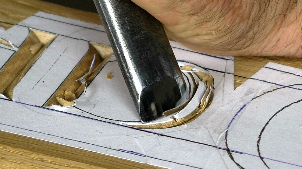
If you are not sure which gouge to pick for a particular curve, you'll find a very useful workshop here.

| 29 May 2022 08:34
Yes! That's exactly what needed! Thank you. *Rushes out to the workshop* :)

| 25 May 2022 19:47
Jenny - If you look at the video here: Letter Carving > Gothic Lettering > 2 Basic Letterform - starting about 14:30 - you'll see the sort of cuts you need, which I think is what you are describing: leaning back on the handle so the cutting edge exits the wood at the lagging corner, though not quite how I see the serif
Apologies for not including the tips of the M and thanks for digging down.
If you have a go on some practise wood I think you'll find there's only one way to make these cuts, and that leads on from the curves you've been doing in the body of the letter.
| 25 May 2022 08:52
And thanks for your answers, Chris! A supplementary:
'1. If the angles at which you cut into the wood remain constant, as the width of the V groove gets narrower so it must get shallower - it's unavoidable geometry. So, yes, the bottom of the valley (the 'root') rises up and runs out at the tip.'
So, to achieve that curved point, would you treat it rather like a serif? A curved stop cut first, from the root and lifting up towards the point; followed by a serif-like cut on the inside of the curve, again, from the root and lifting up towards the point; and finally a sort of backwards serif cut on the outside of the point? Or have I got that completely wrong?!
| 23 May 2022 17:33
Jenny - Thanks for your questions!
1. If the angles at which you cut into the wood remain constant, as the width of the V groove gets narrower so it must get shallower - it's unavoidable geometry. So, yes, the bottom of the valley (the 'root') rises up and runs out at the tip.
2. The order of tasks for carving letters is one I've worked out over time, trying to be efficient in cutting letters and using the same tool as long as possible. So I carve as many of the uprights together, then the diagonals, then horizontals, then serifs, then curves - that sort of thing. And this works well for clusters of letters.
Numbers are a bit different, however, because they come for an Arabic source rather than Roman (from which we derive our alphabet). They are quite unusual, more complicated shapes compared with the Roman (who just used I's and X's etc) and also often appear as just a few - I have often carved just one or two for a project. So the sort of task-order-strategy doesn't work so well. But, still, there isn't anything in any number that needs a different technique that we have for the letters.
So (answering your question!), I would still cut the bottom horizontal of the '2' first; that's the easy bit. Then I'd stab in a centre cut following the curves, then the outer and inner cuts.
I think, though, what you are seeing and wondering about in the '2' is the compound nature of the curves. Mostly I design letters and numbers to use as few tools as possible but, sometimes, and especially with Arabic-derived numbers, it's hard to do. What this means is that you will be using more gouges than you would with, say, a letter like the 'm' in the video above. But that's basically it. Have a look at the video: Lettering > Choosing Gouges for Curves.
Hope this helps!
| 22 May 2022 15:18
Hi Chris, a couple of questions arising from this video.
1. How do you tackle the curved points, such as in the letter M in this video? Apologies if you show this elsewhere, but I have so far failed to find it! Does the bottom of the valley rise up towards the tip of the point? I've been trying to carve the number 2, which in many fonts has such a point.
2. I have just found a slightly different style of 2 on page 108 of your excellent book on lettercarving, which I've been having a go at, but what order of tasks would you recommend for tackling a number 2 like this, which has so many elements in it?
| 18 March 2022 14:04
Jenny - One principal, almost a feature, of gouges is that while you can make a flatter tool cut a quicker curve, you can't make a quicker gouge cut a flatter curve. (By 'quicker' I mean a curve - or gouge 'sweep' - with a big radius.)
So you have to use a flatter gouge on the more vertical, inside part of the letter, which is the flattest, and lead it round into the more curving section.
Hope this makes sense. There's a video on this here: Letter Carving > Choosing Gouges for Curves.
| 17 March 2022 15:36
Why do you use a flatter tool for the inside of the curve? I'm confused slightly; I would have thought the inside was tighter and would need a more curved tool.
| 25 April 2020 21:52
Great Videos! Thank you for sharing this.
| 02 February 2020 08:01
Dan - Thank you for those kind words - music to my ears! Looking forward to seeing some of your work in the gallery.
| 01 February 2020 14:22
Chis, Hi -
Thank you so much for your wonderful instruction. I’ve been working with your letter carving book and now with your videos and find your teaching style to be educational, enjoyable and inspirational. Can’t thank you enough.
Keep Smiling,
Dan
| 25 February 2016 21:50
Richard - The junction where the curve meets the straight (as in 'D' or the picture above) has the same logical geometry as a horizontal stroke meeting an upright (as in 'L'). The important things to bear in mind are the 'walls' on each side of the V trench: keeping them a consistent angle. The geometry more or less takes care of itself. So the outside wall of the curve becomes the end wall of the upright, where the serif would be; and the inside wall of the curve forms what you are nicely calling a 'hanging valley' - it must be so because at half the width it's only half as deep.
I hope I've understood your question aright and this is clear. Have a go with some tools and you'll see how it works out!
| 25 February 2016 15:07
Hi Chris',
I couldnt quite see from the pictures - when a curve meets a straight does the bottom of the curve come in at the same level as the straight or form a little "hanging valley" slightly above? I just wonder because the width of the incoming curve and the straight are quite different in some cases, so if the bottom of the V was the same level presumably the walls of the straight and curve would need to be different angles. Does that make sense?
Thanks, Richard