Menu
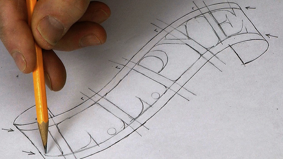
Laying out the lettering is perhaps the most important stage: if your layout isn't good then no matter how well you carve the letters, the finished work will look 'wrong'. The banner curves in a flattened 'S' and where it leads, we must follow. Again I'm using a computer to generate the font (Engravers MT) but the final layout needs your eye.
And from the layout, we move to initial cuts.

| 27 July 2012 06:05
David - yes, my Lettercarving DVD will appear in the library in the (late?) Autumn. In fact we are thinking of changing the lesson categories to give lettering one of its own - there are all sorts of examples here now. Study what I'm doing in the various videos (the 'how') alongside the book, and then just do lots of it - over and over again! A lot has to do with developing muscles and muscle memory, and hand-eye co-ordination.
| 26 July 2012 15:18
Chris. I've really enjoyed all your videos and am looking to focus more on Lettercarving. I recently purchased your Lettercarving book, and was wondering when your Lettercarving video with Rob Cosman might be available on here? Thanks again for great instruction.

| 24 July 2012 20:12
New brush.....? I can't help but feel the need to blow at the waste you remove!!
I've found all the videos most engaging but, more to the point, stimulating; I watch a few and then go off and start carving with a bit more confidence.