Menu
This project is essentially the first stage of a single-subject, relief carving. So, if nothing else, it's a great exercise in lowering, levelling and setting in outines.
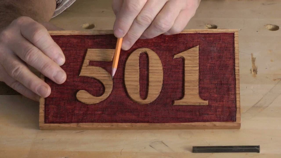
In this first lesson, I give you an overview of the project: a house number in outline relief. Substitute any simple design you like for the numbers - substitute letters for a name plate. The process will be the same.

| 14 January 2013 08:57
Paul - I used my word processor (Word); printed out what I wanted in the font; cut and pasted the layout to my satisfaction; copied (my printer has a copy/scanner facility) the lettering; checked it again; enlarged to size (on printer scanner); and printed a final copy. It's the printer facility of enlarging/reducing that is so wonderful. It's saved me many an hour drawing by hand. Please understand that I also letter many things the 'long way' still ...

| 12 January 2013 21:16
Chris, you mentioned that you had taken the numbers directly off the computer, is there a program that you use , or you can suggest for printing out the letters in various sizes and fonts?
| 01 July 2012 12:59
Andy - It's all about trying to get a sense of evenness in the arrangement of letters and spaces in the layout, and the adjustments you need to achieve this can be quite subtle. Here for example, the 5 sits wide on the header line and makes the thin pointy 1, which hardly touches the line look shorter. So we make the 1 taller to optically compensate. You'll find a lot about layout in my own lettercarving book and similar. Once you can carve the letters, this laying out is the challenge, and fun!
| 28 June 2012 03:46
Can you say more about the decision to scale the digits differently? How do you know how the optical effect will manifest, and how much of an adjustment to make?
| 12 May 2012 18:38
Walter - My lettering book is entirely separate from the DVD; nothing to do with Rob Cosman. GMC Publications. You should be able to find it online or through a book seller.
| 11 May 2012 16:32
chrs i could find your cd on lettercarving but i'm unable to find your book. is it under rob's name only?
| 09 October 2011 08:53
Times New Roman - made slightly more square ('blocky') at the ends of the serifs.
| 04 October 2011 23:54
Which computer font did you use for template? I find the one you used has very good proportions.