Menu
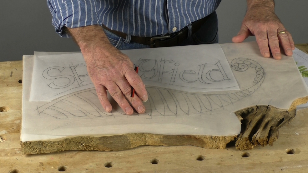
This project can be considered in two parts: the fiddlehead fern as a decorative sunken-relief, and the lettering.
If you are just interested in the lettering, head along to videos 6 and 7. But, before you go...
Let me say that incising letters, once you have the techniques down, is very similar between carveable alphabets (fonts), so there isn't much new here that is not covered in other lettering videos. So, unless you only want a straightforward line of letters for your sign, you need to consider how to add some panache, flair, to your work. And this is what we're doing here.
As we go through the design, from research to laying out, in this introductory workshop you'll see that the piece of wood itself was an inspiration, and my fiddlehead drawing completely influenced the positioning of my letters.
This fiddlehead is 'stylised': ie. made suitable for carving tools and can stand alone. (Look out for how what I do has similarities to mouldings.) You can use the idea, with different sizes or paired left and right handed 'ferns', on all sorts of places: fire surrounds, bedheads and so on.
Lastly, I just want to say that the preparation that you see here - research, drawing, testing the carving etc - took longer than the carving itself. This is normal!
You can't undo carving very easily so you need to get this aspect right before you begin. Here's the bottom line: Your design, if good, will carry not-so-good carving. But, no matter how good your carving, if your design is poor, the result will also be poor...