Menu
Here's our first font, which has a chunky 'wild west' sort of look and is beautifully space-filling in the block.
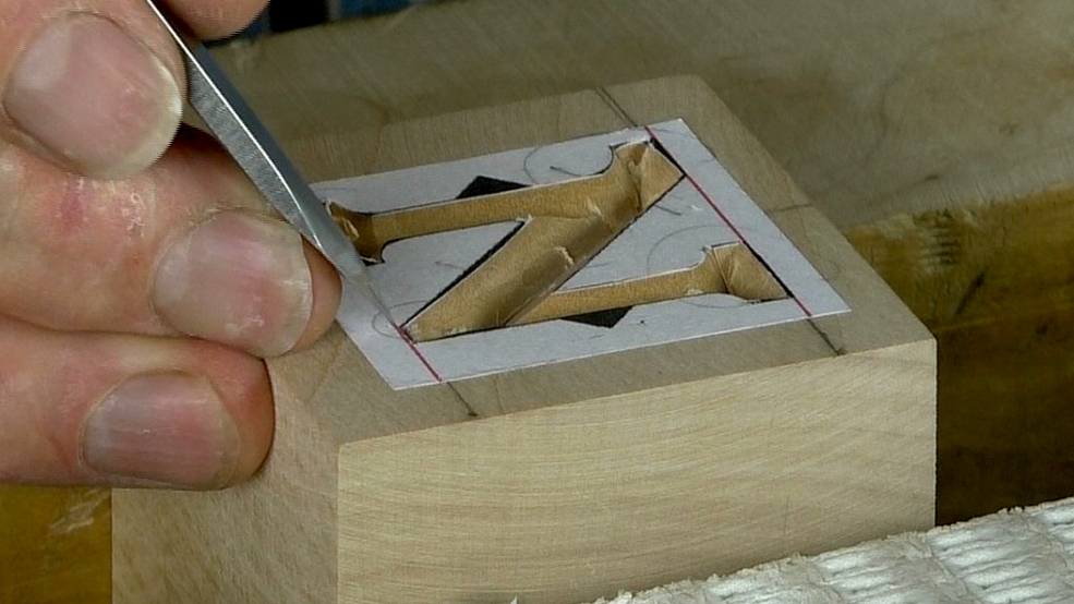
My usual way of working, which you see here, is to start with the straight bits - what I think of as the 'low hanging fruit' - move on to the serifs and junctions and finish by tackling the curves.
When you've finished, take the paper off, change the lighting and finesse the letter edges and roots (the bottom junction in the letter trough).