Menu
Big, deep lettering needs to be carved somewhat differently to the more 'normal' sizes (somewhere less than 2in. 50mm).
The main problem is geometric: If you cut the upright of a letter at the usual 60deg., the depth to which you descend is a bit less than the width. So, you'd cut a big letter with an upright 1.5in. 37mm. wide only a little less than that into your wood! Add to this the wood behind the letter and you start to need quite substantial boards of timber. And, there's considerably more work: the volume of the trench increases by a cubic factor of the dimension.
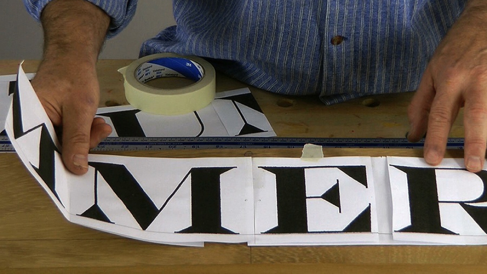
So we need a different approach, which is what I'll show you in these lessons. I also discuss using computer fonts - in this case, Engravers MT.

| 22 June 2015 18:12
Robin - As far as I am aware my lettering book is still in print. I'm afraid I have nothing to do with the distribution. I just checked and both Amazon.co.uk and Amazon.com have it.

| 22 June 2015 12:22
Hi Chris, Im over the pond in Englad and am having great difficulty in obtaining your book on lettering. Is it out of print or in the process of being printed again? Really would like this in my library of your carving books.
Thanks for all your books and videos, so glad I joined.

| 12 May 2013 08:48
Thanks! I finally caught up with this video and the idea of just using Engravers MT through the pc. I would add a suggestion as an IT specialist: if one uses "Word Art" then the sizing in all dimensions is adaptable and flexible. I laid it out through Publisher on a "page" size that matched my carving area and could see easily the relationship between my wood and my letters. Now, of course, I have to carve them!