Menu
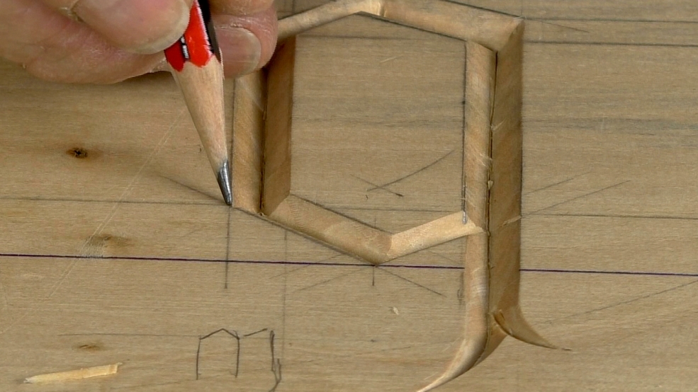
In this video I cut a practise letter and take you through the various stages of carving the Gothic letterform. If you've already been carving letters, you'll find the method quite straight forward.
Mistake: Let me point this out to you in case you miss it! It's in the extra lines that I used when drawing the fundamental form in the last video: 2/10 and 1/10 below the header and footer respectively. For some reason I draw two 2/10 lines for this demo. Don't follow? You'll see. No excuse I'm afraid. It's arbitrary, my choice to make top and bottom a little different, the important point is to be consistent between letters and stick to what you decide.

| 21 January 2019 12:36
FYI ... There's a free font called "Seagram" that is the closest I've found to Chris's Gothic / Blackletter. It's not as angular as Chris's but it has the advantage of being a font that is easily scalable and supports kerning, baseline shift and leading if the application supports these text feature. It has a few more curves but it's the most angular one that I found after searching through quite a few.
This font is free and downloadable at dafont.com. This is a link: https://www.dafont.com/seagram-tfb.font