Menu
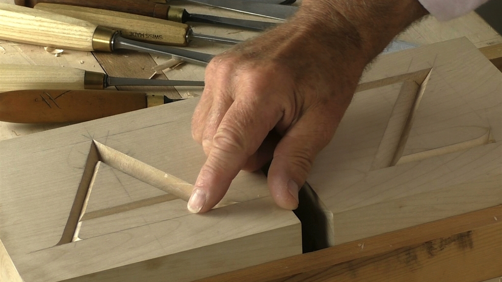
Carving the junctions and serifs. I don't do much talking here, more just doing - I think I've said enough about the steps in lessons 1 and 2 in this project folder!
Apologies for the hollow-sounding audio around 7:30 - 9:00; we had a hitch with the lapel mic.

| 21 September 2018 08:51
William - Good question! The commonest height of letter over the years has been 2in (50mm) so that's the one I get students to practise first. There isn't anything different about the techniques as the letter reduce in size, just smaller tools, but other factors come in:
How small a letter you can carve depends on the tightness of the wood fibres. So the smallest letters might be in something like Boxwood; whereas something like Oak has an open grain and it's difficult to get the detail without bit breaking off.
Another point is that it's easier to get letters looking the same when they are quite large; as they get smaller so you have less wood to play with and every single touch of the gouge or chisel counts.
I actually now decline carving letters below 1in. (25mm). Anything less is a real strain on the eyesight, if nothing else: I have to use a magnifying lens and it really isn't a pleasant experience. And at this stage in my (er..) career, I don't have to do it!

| 21 September 2018 03:42
Absolutely first class video series on carving letters. Most of you lettering appears to be about 2.5 to 3 inches in height. In your opinion, what is the minimal height letter that can be carved? When approaching 1.0 inch height, do you have any special technique to offer us?